

Certainly over the years architects and designers have approached design with "wellness" in mind. Much of this is to offer spaces which allow individuals to live and function in a positive environment. In fact you only have to search wellness to see how relevant it is in many

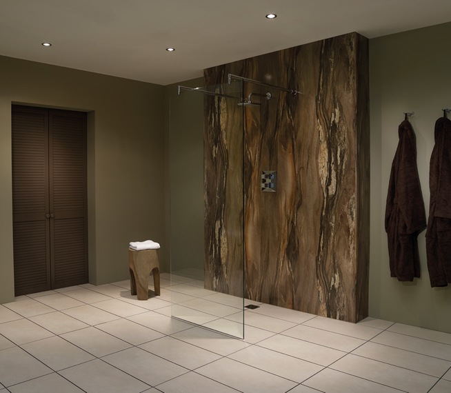
From here we see the family bathroom receiving the greatest makeover. No longer just a space to bathe or shower, it has become the starter for creating that multi generation space. From wetrooms to steam rooms , showers are still evolving. Technology includes mirrors doubling as flat screen TV s, electronic sensor taps, thermostatically controlled showers, led shower heads, sound systems recessed into ceiling, and air injected taps to reduce water use.
Ordinary tiles and grout on walls have been making way for ceiling height water proof panels. White raised shower trays being replaced by wetroom floors.

While there will always be a favourite accent colour in furnishings, the bulk of showhomes still play safe with a neutral pallette. Magnolia has long gone, with white being around some time. What we might see is layering of whites. By this I mean a few shades of white close to each other that work to highlight different surfaces. This is something that many people who use Farrow and Ball paint will be used to doing, but tricky to get right.
As an alternative to white, grey is becoming more popular.
Surprisingly feature wallpaper is still hanging in there. Big bold, brash, and often shiny - 3 rolls is generally all needed. Thankfully there are alternatives in the form of faux brick, and both engineered, and recycled woods which bring more texture and life to a room.
The industrial look is perfect for apartments and older properties. Shiny chrome taps have been replaced by antique brass or nickel to compliment a more relaxed kitchen space. It is surprising how many cookery shows have a background of exposed brick in the kitchen areas.
A few years ago it might not have been out of place to install a bright red signature kitchen. Now the look is more refined, greys and creams as popular as white.
Much more attention is given to the work surface. In fact many granite suppliers will say how much in demand that product is now. Overall the use of natural materials like granite and porcelain have been on the increase in the last few years, and this doesn't appear to be slowing down.
Porcelain on the floor is perfect for heavy traffic areas.
What I have written about elsewhere in this blog has been bio flame fires. While I see no emerging trend as such, they have been spotted in prestigious London apartments recently. They really do look stunning, so that will be my one off the wall prediction for 2016..
For advice on delivery of any of the products mentioned, contact me


